CSS3 border-radius property allows web developers to round corners in their design, without the need for corner images or the use of multiple div tags.
Until CSS3 becomes more commonly supported, you can also use the -moz- prefix for Firefox support, and -webkit- for Safari/Chrome support.
border-radius property:
border-radius shorthand property can be used to define all four corners simultaneously.
The property accepts either one or two sets of values, each consisting of one to four lengths or percentages.
Syntax:
border-radius: [ <length> | <percentage> ]{1,4} [ / [ <length> | <percentage> ]{1,4} ]?
Eg:
border-radius: 5px 10px 5px 10px / 10px 5px 10px 5px;
border-radius: 5px;
border-radius: 5px 10px / 10px;
The first set of (1-4) values define the horizontal radii for all four corners.
An optional second set of values, preceded by a '/', define the vertical radii for all four corners.
If only one set of values are supplied, these are used to determine both the vertical and horizontal equally.
For each set of values the following applies:
If all four values are supplied, these represent the top-left, top-right, bottom-right and bottom-left radii respectively.
If bottom-left is omitted it is the same as top-right, if bottom-right is omitted it is the same as top-left, and if only one value is supplied it is used to set all four radii equally.
Individual rounded corners:
Rounder corners can be created independently using border-*-radius properties:
border-top-left-radius
border-top-right-radius
border-bottom-left-radius
border-bottom-right-radius
The border-*-radius properties can each accept either one or two values, expressed as a length or a percentage (percentages refer to the corresponding dimensions of the border box).
Eg:
border-top-left-radius: 10px 5px;
border-bottom-right-radius: 10% 5%;
border-top-right-radius: 10px;
Examples:
Eg:
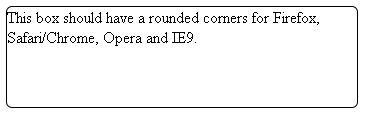
<html>

<head>

<style type="text/css">
.exampleborderradius {
  width:350px;
  height:100px;
  border:1px solid black;

  border-radius: 6px;
  -webkit-border-radius: 6px;
  -moz-border-radius: 6px;
}
</style>


</head>

<body>

<div class="exampleborderradius">This box should have a rounded corners for Firefox, Safari/Chrome, Opera and IE9.</div>

</body>

</html>
Outputs:
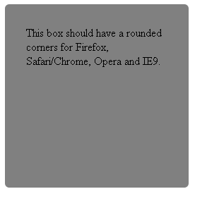
Eg2:
<html>

<head>

<style type="text/css">
.exampleborderradius {
  background-color: grey;
  width: 200px;
  height: 200px;
  padding: 30px;

  border-radius: 6px;
  -webkit-border-radius: 6px;
  -moz-border-radius: 6px;
}
</style>

</head>

<body>

<div class="exampleborderradius">This box should have a rounded corners for Firefox, Safari/Chrome, Opera and IE9.</div>

</body>

</html>
Outputs:
For auto-generating css code for css rounded corners, sse here.
Css: Circle
To create a circle, you can use border-radius on the element.
This will create curved corners on the element.
If you set it to 50% it will create a circle.
Note: if you set a different width and height, you will get an oval instead.
Note2: change size of circle using width and height css properties.
Eg: css circle:
<!DOCTYPE html>

<html>
<head>
    <meta name="viewport" content="width=device-width" />
    <title>Index</title>
    <style>
        #circle {
            background: lightyellow;
            border-radius: 50%;
            width: 100px;
            height: 100px;
        }

        #circle2 {
            background: lightblue;
            border-radius: 50%;
            width: 100px;
            height: 100px;

            display:inline-block;  /* if you are using a span tag */
        }

    </style>

</head>
<body>
    <div>
        <div id="circle"></div>
        <span id="circle2"></span>
    </div>

</body>

</html>
Outputs:
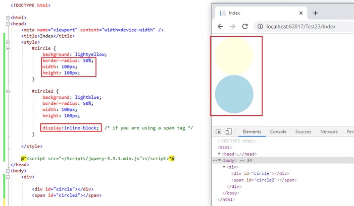
For more information, see here.
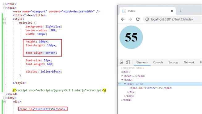
Css: Circle with text in the middle:
To draw a circle with text in the middle, set line-height to the same value as the height of the div, and add tex-align property with center value.
Eg: to draw a circle with text in the middle:
<html>
<head>
    <meta name="viewport" content="width=device-width" />
    <title>Index</title>
    <style>
        #circle2 {
            background: lightblue;
            border-radius: 50%;
            width: 100px;

            height: 100px;
            line-height: 100px;

            text-align: center;

            font-size: 55px;
            font-weight: 600;

            display: inline-block;
        }

    </style>
</head>
<body>
    <div>
        <span id="circle2">55</span>
    </div>

</body>

</html>
Outputs:
Note: to vertically center text, use vertical-align property with middle value. ie: vertical-align: middle.
For more information, see here.